Got something to say or just want fewer pesky ads? Join us... 😊

[Albion] New shirt: yay or nay?

New shirt: yay or nay?

  • Yay: I like it

    Votes: 388 65.9%
  • Nay: it’s horrible

    Votes: 201 34.1%

  • Total voters
    589


papajaff

Well-known member
Aug 7, 2005
3,980
Brighton
Loved today's kit. Said it before but never been a fan of the stripes.


Best home shirt we’ve had since Nike took over.


Sent from my iPad using Tapatalk Pro

This. Haven't minded some of the home kits we've had in the PL, but I haven't liked any of them enough to buy one since the 2011-12 B&HJobs Errea shirt. So many of them have leaned towards the white stripes being more prominent than the blue, which I've not been a fan of.

The collar reminds me a little bit of the collar on THAT England '96 away kit, but I like how it looks when unbuttoned.

It's a massive thumbs up from me, and it's the first new home shirt that I've bought in nine years!


BN41Albion

Well-known member
Oct 1, 2017
6,470
Love it. Pin stripes for one season as a throwback... Why not? Retro and very smart imo, esp with the gold touch


Grombleton

Surrounded by <div>s
Dec 31, 2011
7,356
Really like it. Looks good closer up and whilst you can't see them when they're playing, i couldn't give a shit as it's not as if we'd clash with the opposition, so that argument can **** off.

Best once since our 2011-12 kit.


Kosh

'The' Yaztromo
I absolutely love it.

Even more so based on the fact we finally beat those absolute ****ers wearing it.

The collar reminds me of Nogan era, the rest belongs to the 80s. Sure it’s a bit Stalybridge Celtic but, you know ****ing what? that makes me love it all the more.

Rock and roll.


JJ McClure

Go Jags
Jul 7, 2003
10,873
Hassocks
Love it from the front, but they’ve gone and made a complete hash of the back again.
One of the reasons I was looking forward to a solid shirt was to get away from the shit patchwork designs we’ve had the last few years...but no they’ve gone a done it again, it’s not even the same colour blue FFS.


SeagullinExile

Well-known member
Sep 10, 2010
5,750
London
2193-504.jpg


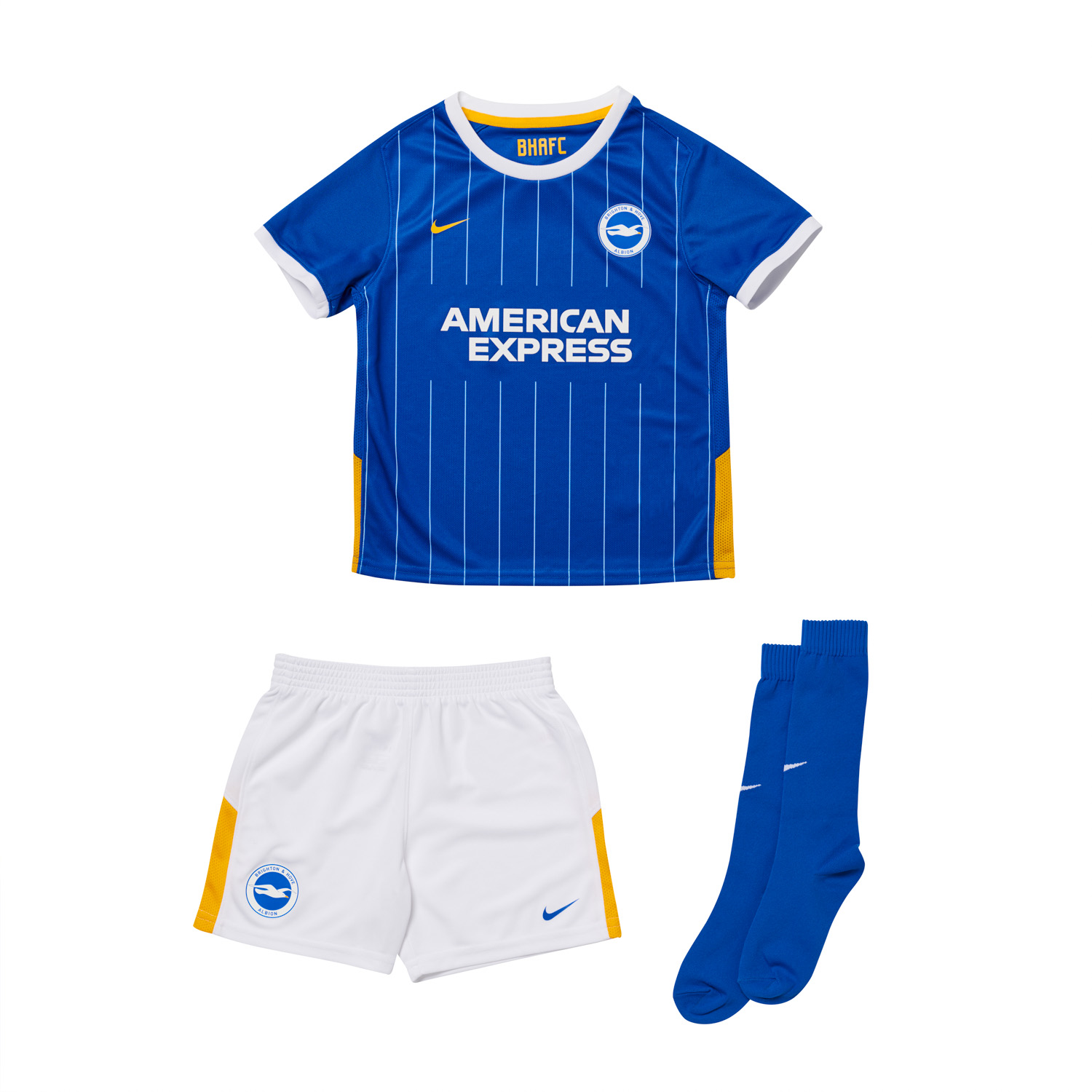
There is a version without the collar on the website.

Now that IS better. A bit more 'Phoenix Breweries' - Just missing the red pin stripe!


hans kraay fan club

The voice of reason.
Helpful Moderator
Mar 16, 2005
61,644
Chandlers Ford
Absolutely beautiful. Best since the ‘’Brighton and Hove Jobs’ kit.

Great job


Albion and Premier League latest from Sky Sports


Top
Link Here