You are using an out of date browser. It may not display this or other websites correctly.
You should upgrade or use an alternative browser.
You should upgrade or use an alternative browser.
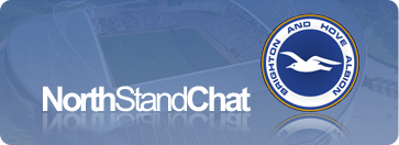
NSC Logo
- Thread starter mcshane in the 79th
- Start date
More options
Who Replied?Skint Gull
New member
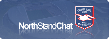
I like the one that everyone else seems to like too but like Mr Juice I have a bit of a problem with the NSC writing? Its not so much the colour, its the fact its not very discreetly slapped half over the seagull! Can it not run in a line below the seagull or summin, even if the main background picture is zoomed out a bit?
Barrel of Fun
Abort, retry, fail
i wish people would stop writing 'this' it's f***ing gay.
Agreed. Where did it spawn from?
Bluejuice
Lazy as a rug on Valium
Not to mention it's too big and therefore;
a) collides with the advert and
b) gives me a massive horizontal scrollbar (which I hate!)
Either you are viewing it on a MOBILE PHONE or your resolution is set too low.
Get it on 1024x768
imissworthing2
New member
Well I for one hate it, please leave the logo as it was.
It's class")
It's class
Leicester Seagull
New member
- Oct 24, 2009
- 218

falmer crane
That is fantastic!
Must admit that I also think the current logo looks out of place and prefer the old one.
If it must be changed, then Mike is surely on the right track with the above! It has the same iconic style of the old logo whilst also fitting in with the forums colour scheme, plus it signifies the new era in the clubs history that is currently unfolding.
Either you are viewing it on a MOBILE PHONE or your resolution is set too low.
Get it on 1024x768
1024x600 (netbook), same width as you.
That is fantastic!
Must admit that I also think the current logo looks out of place and prefer the old one.
If it must be changed, then Mike is surely on the right track with the above! It has the same iconic style of the old logo whilst also fitting in with the forums colour scheme, plus it signifies the new era in the clubs history that is currently unfolding.
cheers that is what i was going for and showing off the thinner seagull
if it would be possible to have different styles/themes for the forum so people can pick and choose which to use that would be probably be helpful. i have created themes before on other forums and could contribute a few
That is fantastic!
Must admit that I also think the current logo looks out of place and prefer the old one.
If it must be changed, then Mike is surely on the right track with the above! It has the same iconic style of the old logo whilst also fitting in with the forums colour scheme, plus it signifies the new era in the clubs history that is currently unfolding.
This.
Oh...

Juan Albion
Chicken Sniffer 3rd Class
The text is the wrong colour. It is weak and almost apologetic.
Dizzle.
New member

The Merry Prankster
Pactum serva
Much prefer the old one Distinctive, unique and differentiated us from the herd with more than a passing nod to our history. The new one is MK Dons stylee.
Out of all the options, I like this the best. Although I'm still not convinced it is as good as the old logo.
Dizzle.
New member


This one.

That's not to knock some of the really impressive efforts on this thread. I particularly like Dizzle's round badge one. BUT, I love the NSC logo, with the single floodlight. Please don't change it.
That's not to knock some of the really impressive efforts on this thread. I particularly like Dizzle's round badge one. BUT, I love the NSC logo, with the single floodlight. Please don't change it.
Kalimantan Gull
Well-known member
The Falmer crane one was very clever. I liked it.
The Wizard
Well-known member
- Jul 2, 2009
- 18,402
This one.
That's not to knock some of the really impressive efforts on this thread. I particularly like Dizzle's round badge one. BUT, I love the NSC logo, with the single floodlight. Please don't change it.
Agree.
Given the current trend for the alternative vote (AV) system...
This would be must first choice;
and this my second choice:
This would be must first choice;
and this my second choice: