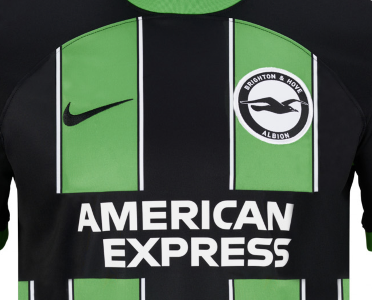
The green shirt doesn't have an 'H'.Now many posters are saying they like the green away shirt with its H, but not this shirt.
You are using an out of date browser. It may not display this or other websites correctly.
You should upgrade or use an alternative browser.
You should upgrade or use an alternative browser.
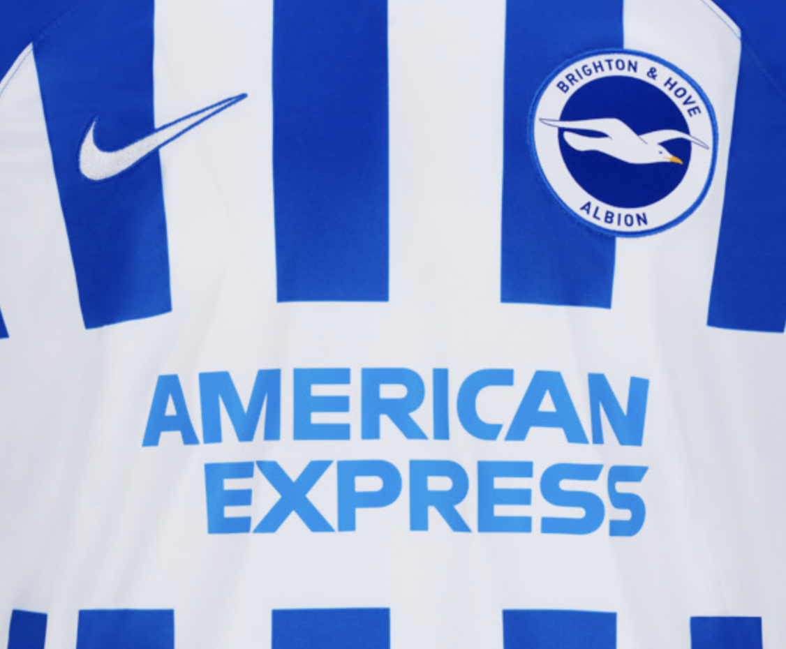
[Albion] Brighton & Hove Albion 2023/24 home kit
- Thread starter mile oak
- Start date
More options
Who Replied?HastingsSeagull
Well-known member
Thin stripes are definitely better than thickSeem to have thin stripes every two years. Favourite ? I'm a thin rather than a thick stripe man.
View attachment 163642
Blue shorts and socks would be a huge upgrade
But it looks like it might be the worst of the four in this image
el punal
Well-known member
‘Cos we press well and always score?Think its alright - not very exciting though. Looks a little bit weird close up but will look good in action.
No idea why they decided to photograph it in a German brothel.
The stripes are not symmetrical.
Classic Nike detail
They got 2 colours right though so on their scale it’s a relative success.
Classic Nike detail
They got 2 colours right though so on their scale it’s a relative success.
Thunder Bolt
Silly old bat
It looks like an H to me.The green shirt doesn't have an 'H'.
Colonel Mustard
Well-known member
- Jun 18, 2023
- 2,123
Stick to the retro Bukta kit on sale in the club shop. Classic design, no sponsor name, and made of cotton so much nicer to wear.
The new one is almost OK but the solid blue shoulders seem pointless and spoil it. Worst part though is the back with that big white patch. Only kids should have a name and/or number. Adults look a bit silly with their name or the name of their top fave player on it.
I prefer the away kit though there's still a big blank patch on the back. I'm very surprised that there are two different stripe designs for the home and away shirts. Surely the stripes are a brand and should be the same except for different colours?
Oh well. I've never bought a current replica shirt and don't intend starting now so when all's said and done I'm not that bothered.
Farehamseagull
Solly March Fan Club
I really like it - much prefer it to last season’s.
HangletonGull
Well-known member
- Apr 10, 2023
- 1,471
The problem is the centre stripe is off centreComfortably the worse home shirt since moving to the Amex.
You think the GREEN vertical stripes and BLACK horizontal stripe look like an H?
You sure about this?
- Jan 3, 2012
- 16,648
All the comments about Nike being lazy jar somewhat. They presumably don’t dictate what the kit will look like, I presume. I would trust there is an element of briefing or communication and the club would agree the kit.Nike really do produce some of the laziest, uninspiring shirts going.
It winds me up that I get so wound up about it but good grief I'd love it if they employed someone with a bit of bravery in their design team.
”can we have one without a collar this year”
”we don’t want anything too outrageous.”
”we like the idea of block colour on the shoulders.”
”we don’t like the stripe bang in the middle”
I really like it anyway, especially with blue socks and shorts!!!

This is a poor show from the club and Nike.You think the GREEN vertical stripes and BLACK horizontal stripe look like an H?
You sure about this?
They should be considering people with green/black colour blindness.
Surely it's not a centre 'stripe' though. It's a centre 'line' between the white and blue stripes?The problem is the centre stripe is off centre
HangletonGull
Well-known member
- Apr 10, 2023
- 1,471
ha
Had d a good look see what you mean but it makes it look wrongSurely it's not a centre 'stripe' though. It's a centre 'line' between the white and blue stripes?
Washboard Didgets
Graphic Designer
The "off-centre stripes" on the new shirt mean that the club badge now sits centred on the edge of two stripes.
I don't hate it. Would have preferred a blue back though.
Shame the Amex logo is floating in a huge empty space in the stripes, it's a lot tighter on the away shirt.


I don't hate it. Would have preferred a blue back though.
Shame the Amex logo is floating in a huge empty space in the stripes, it's a lot tighter on the away shirt.
Easy 10
Brain dead MUG SHEEP
Bravery as in what ? I saw a fake mock-up with diagonal blue and white stripes last week, would that be considered "brave" ? I can just imagine the complete MELTDOWN on here if we went down that kind of route with something totally off-piste.Nike really do produce some of the laziest, uninspiring shirts going.
It winds me up that I get so wound up about it but good grief I'd love it if they employed someone with a bit of bravery in their design team.
The main consensus seems to be thats its a bit dull, a bit meh. Well, its a blue and white striped shirt, there's not a whole lot you can do with that apart from arsing about with the width of the stripes, which has also been done plenty of times before.
My opinion - its fine. They've not done anything weird with it. Its just a standard average typical Albion blue and white striped shirt. What else do people want ??
brighton_tom
Well-known member
- Jul 23, 2008
- 4,962
How many more years do we have to suffer with Nike?
Quebec Seagull
Vive le football... LIBRE!
I love the yellow accents -- they make the blue pop. The design is off the beatem track, and a successful experiment, as far as I'm concerned. Slight variations on the same motif yeae after year get boring fast.I might be the only.person who didn't mind the 'piping'
.

