Got something to say or just want fewer pesky ads? Join us... 😊

The 'new kit thread' thread


DarrenFreemansPerm

⭐️⭐️⭐️⭐️
Sep 28, 2010
17,335
Shoreham
Think it wouldn't look nearly as bad if the white on the sponsor panel was the same shade as the stripes. At the moment there is such a contrast it looks like the sponsor panel is designed to be peeled off.

This, I wonder if it is just a poor transfer and when the shirt is released its a) the right colour b) the right size.

In some of the pics it looks too tight somehow, like thirt is being pulled in by it.


Wozza

Shite Supporter
Jul 6, 2003
23,659
Online
You're not quite comparing apples with apples there - if that logo was red I doubt they'd have taken that approach.

Blue logo okay on our reserve (and 3rd) shirts though...


Charles 'Charley' Charles

Well-known member
NSC Patron
Oct 8, 2005
3,522
The Mile Of Oaks
This, I wonder if it is just a poor transfer and when the shirt is released its a) the right colour b) the right size.

In some of the pics it looks too tight somehow, like thirt is being pulled in by it.
I'm hoping that it's just the way the flash has bounced off the sponsor panel making it seem much brighter. Until I see it in person on a general release version it's difficult to be certain.


DarrenFreemansPerm

⭐️⭐️⭐️⭐️
Sep 28, 2010
17,335
Shoreham
You're not quite comparing apples with apples there - if that logo was red I doubt they'd have taken that approach.

Fair comment, I think I'm just sulking really because in my humble opinion the shirt is gorgeous, the stripes, collar, sleeves, back amd the socks and shorts. We were so clost having it spot on but for that pesky ill fitting panel.


Wozza

Shite Supporter
Jul 6, 2003
23,659
Online
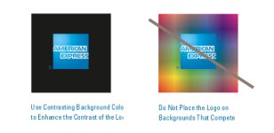
In fairness, the current American Express guidelines wouldn't allow the square logo on stripes..

logo.jpg

But I would have lobbied VERY hard for new rules specific to sporting kit.

http://www.municipay.com/docs/Amexlogo_guidelines.pdf


sparkie

Well-known member
Jul 17, 2003
12,541
Hove
We've got iron on stickers on all kits going forward until we get a new supplier or Nike change their policy.

Glad I've got 2 recent kits with integrated logos ( AMEX celebratory, and last year's home kit ).

.... but I am very tempted by this years Red and Black, despite the logo.


Grombleton

Surrounded by <div>s
Dec 31, 2011
7,356
Block panel sponsor logo?


You're confusing Nike's kit with the American Express guidelines - its AmEx who say that the logo must be block panelled, not Nike.

EDIT: probably a bit late to the show here. Carry on.


Triggaaar

Well-known member
Oct 24, 2005
50,219
Goldstone
From Paul Barber...

A few points:

• our sponsor logo is "white blocked" - which emphasises the nature of the logo application - to meet Amex corporate ID guidelines - it's conforming to the corporate ID rules of one of the world's most protected brands!

• if we could have done it a different way we would have
Wouldn't it look a lot better if you simply swapped the stripes around?


MattBackHome

Well-known member
Jul 7, 2003
11,733
From Paul Barber...

A few points:

• Nike uses plastic iron on-style logos on all its shirts - including Barcelona, Juventus and Man U; the sublimation printing option (as per Errea's last kit) isn't available to any club from Nike

• our sponsor logo is "white blocked" - which emphasises the nature of the logo application - to meet Amex corporate ID guidelines - it's conforming to the corporate ID rules of one of the world's most protected brands!

• if we could have done it a different way we would have - striped shirts are always a challenge for the application of sponsor logos (or numbers) and this is further complicated by a sponsor logo that's blue!

• the size of the white block is determined by Football League regulations and, like most sponsors, Amex require maximum permitted size for their logo; there also has to be a minimum amount of white space around the Amex lettering

• last year's shirt also had a "white block" around the Amex logo - in the sublimation process it meant that the stripes were "broken" in a different way as it was printed in to the shirt design (many fans hated this!). Sometimes you can never win with kit design!

• also, to anticipate another question that's come up, we can't have a blue or white Nike logo because one half of it wouldn't show up against our stripes! So it had to be black (or another contrasting colour)

It's embarrassing that PB has spent any time at all defending a kit design. I don't particularly love the new kit (apart from the orange) but really think that he should have better stuff to be getting on with than this.


itszamora

Go Jazz Go
Sep 21, 2003
7,282
London
From Paul Barber...

A few points:

• Nike uses plastic iron on-style logos on all its shirts - including Barcelona, Juventus and Man U; the sublimation printing option (as per Errea's last kit) isn't available to any club from Nike

• our sponsor logo is "white blocked" - which emphasises the nature of the logo application - to meet Amex corporate ID guidelines - it's conforming to the corporate ID rules of one of the world's most protected brands!

• if we could have done it a different way we would have - striped shirts are always a challenge for the application of sponsor logos (or numbers) and this is further complicated by a sponsor logo that's blue!

• the size of the white block is determined by Football League regulations and, like most sponsors, Amex require maximum permitted size for their logo; there also has to be a minimum amount of white space around the Amex lettering

• last year's shirt also had a "white block" around the Amex logo - in the sublimation process it meant that the stripes were "broken" in a different way as it was printed in to the shirt design (many fans hated this!). Sometimes you can never win with kit design!

• also, to anticipate another question that's come up, we can't have a blue or white Nike logo because one half of it wouldn't show up against our stripes! So it had to be black (or another contrasting colour)

This is all well and good, Mr Barber, but it still looks shit.


Grombleton

Surrounded by <div>s
Dec 31, 2011
7,356


D

Deleted member 22389

Guest
Wonder how many clubs would love to have such a massive brand such as American Express sponsoring the stadium and the kit.
The last sponsor that came close to this was British Caledonian


Grombleton

Surrounded by <div>s
Dec 31, 2011
7,356
It's embarrassing that PB has spent any time at all defending a kit design. I don't particularly love the new kit (apart from the orange) but really think that he should have better stuff to be getting on with than this.

He probably thinks that people should have better things to do than to email him with banality relating to the kit, but he's going to reply as its the professional thing to do. The kit won't change now, so we've just got to live with it.


DarrenFreemansPerm

⭐️⭐️⭐️⭐️
Sep 28, 2010
17,335
Shoreham
He probably thinks that people should have better things to do than to email him with banality relating to the kit, but he's going to reply as its the professional thing to do. The kit won't change now, so we've just got to live with it.

I live in hope. Obviously supply and demand and stock levels have completely changed but I remember and still have my Super League shirt that was released with Sandtex on a white panel, then they changed it to no panel #fingerscrossed


sam86

Moderator
Feb 18, 2009
9,947
Surely it still could have been an iron on logo but look a lot better than the final outcome?
I don't get why the white looks so different, unless the shadow around the panel is tricking the eye.
Also why it overlaps by the tiniest amount making it look like an error.

Edit: actually, is there even a shadow around the panel, or is it just the fact its iron on causing some sort of ridge...

20140703-115730-3083_420x315_w.jpg


:nono:


Albion and Premier League latest from Sky Sports


Top
Link Here