Got something to say or just want fewer pesky ads? Join us... 😊

[Albion] The best badge? Poll

The best Albion crest/badge?

  • 1948-1970

    Votes: 19 9.3%
  • 1956-1958

    Votes: 13 6.3%
  • 1968-1969

    Votes: 3 1.5%
  • 1970-1971

    Votes: 0 0.0%
  • 1974-1975

    Votes: 7 3.4%
  • 1977-1980

    Votes: 37 18.0%
  • 1980-1998

    Votes: 17 8.3%
  • 1998-2000

    Votes: 0 0.0%
  • 2001-2002

    Votes: 19 9.3%
  • 2000-2011

    Votes: 15 7.3%
  • 2002-2004

    Votes: 6 2.9%
  • 2011-

    Votes: 69 33.7%

  • Total voters
    205


rudolf hucker

Active member
Jul 26, 2009
138
Hove
My first game was 1963. Always thought the later badges didn’t quite come up to it. So voted that way.
Like the current badge though.


May 21, 2023
15
It was a plain seagull, like the Hollister logo. We didn't get sued by them, fortunately. Below is an away kit from 2003-04.

.
images


Brighton-Away-Shirt-Yellow-Skint-Errea_800x.jpg
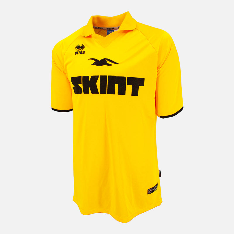
That's what I understood too - change it or we'll sue. Assume our current badge is fully copyrighted.


Doug-ees-evil

Active member
Nov 18, 2011
68
74-75 for me, the Dolphin is great.
Of the Seagull badges the current iteration is my favourite
Exactly the same here.
Dolphin trumps a Seagull any day really... I'm not aware of any other 'marine-based mammal' club nicknames or mascots in the Football League?
(which makes it more unique – and great that dolphins have reappeared again off our shores in recent years).

Also like the fact the dolphin is wearing a non-James Milner approved snood.

Admittedly "Dolphins..Dolphins" is certainly a sh*tter chant compared to Seeeeegulls...Seeeeegulls!
Something the retiring Derek Chapman + chums no doubt considered in the boozer that famous day.

But... of the Seagull badges, current one is by far the best and pointing in the right direction :thumbsup:
 
Last edited:


BN9 BHA

DOCKERS
NSC Patron
Jul 14, 2013
21,796
Newhaven
Voted 77-80, also like the 48-70 badge.
No mention of this one below that was on programmes and pin badges, never on a shirt though but neither was the Dolphins badge. Not sure if the Dolphins badge was on any programme.

IMG_1427.jpeg
 

Attachments

  • IMG_1426.jpeg
    IMG_1426.jpeg
    1.8 MB · Views: 13


HCxUK

Well-known member
Apr 18, 2014
862
Before my time but the 1977-1980, by far..

Love the font and the yellow trim on the badge.


Wallace

Active member
Nov 9, 2016
132
Voted 80-98, it lasted a long time for a reason. The Dolphin badge is class, bear in mind Palace at the time were called the 'Glaziers' so rubbish nicknames were all the rage. The current badge is also excellent, hopefully that idiot Barber doesn't decide to redesign it anytime soon...


US Seagull

Well-known member
Jul 17, 2003
3,617
Cleveland, OH
Why was the seagull so fat from 98 to 2011? I think we know who's been eating all the pies.

Also the ampersand on the 98 one just looks weird and cluttered.

I genuinely think our current one is the best. It's simple and clean. It's quite similar to the 77-80 one.


US Seagull

Well-known member
Jul 17, 2003
3,617
Cleveland, OH
Any heraldic badge for me. Most badges were of that type years ago, but very few left now. Fulham is a great example of how to go from a beautiful one to a complete mess.
View attachment 182835
I get what you're saying. And I do love the heraldic style, but you gotta have your logo be simple enough that a kid can sketch on the back of their work book during a boring 3 period history class. The heraldic ones are just too complicated, cluttered and hard to recognize.

Also think of the poor tattoo artist that has to draw that on some fat middle-aged guys stomach.


Winker

CUM ON FEEL THE NOIZE
Jul 14, 2008
2,419
The Astral Planes, man...
I’ve just realised our seagull changed direction on our current badge.

For some reason I’m outraged. 😂

It has however, seemingly coincided with a change of direction and luck.

Naturally the 70s badge gets my vote.

I’m sure Ritchie Blackmore would vote the same way.
Wouldn't Ritchie have gone for the rainbow badge?
Rainbow Badge.jpg


studio150

Well-known member
Jul 30, 2011
29,808
On the Border
I'm a bit worried that this thread will prompt the club to launch a new badge, with the seagull flying upwards and higher.


Herr Tubthumper

Well-known member
NSC Patron
Jul 11, 2003
60,323
The Fatherland
I like the current badge.

We've managed to create a simple, classic design without producing something that looked like an idea from a local council's focus group (see Fulham/Arsenal/West Ham).
Same. It’s simple and clear.


Albion and Premier League latest from Sky Sports


Top
Link Here