Home and Away
Well-known member
- Sep 18, 2018
- 708
Absolutely. Gets my vote. If it was changed back I would quietly hide from the binfest in joyous contentment.Pre my time, but I’ve always loved the look of the 1958 badge. I picture vast crowds and Adrian Thorne. The badge is classy.

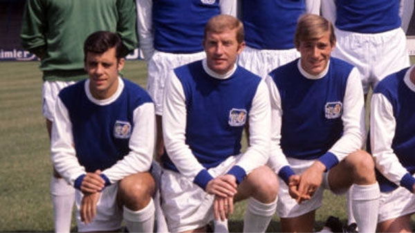

It was a conscious decision - to represent the club 'looking forwards, rather than back'.I’ve just realised our seagull changed direction on our current badge.
For some reason I’m outraged.
It has however, seemingly coincided with a change of direction and luck.
Naturally the 70s badge gets my vote.
I’m sure Ritchie Blackmore would vote the same way.
Well I must have been unconscious when that decision was made public, as I’d completely missed itIt was a conscious decision - to represent the club 'looking forwards, rather than back'.
And instantly recognisable.From an old bastard, my view is obviously tainted by nostalgia.
So it this the current one, all day long, for me. Cool, clean crisp and elegant.
I don't remember that 2002-04 one at all. That was just after I finished university and was starting my past life in London, so I wasn't really following the club as closely as usual. But I'm still a bit spooked that I don't remember it whatsoever. Voted for it though because I think the silhouette thing is cool. 77-80 and 00-11 also strong contenders for me, I was expecting to vote for one of those.