Got something to say or just want fewer pesky ads? Join us... 😊

New shirt has arrived


Superphil

Dismember
Jul 7, 2003
25,421
In a pile of football shirts
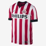
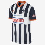
There is hope for the future if the club can secure one of these stripe styles when Eindhoven and Monterrey have finished with them, white bar in the centre, space for a better Amex logo perhaps?

image.jpg image.jpg

View attachment 56696. View attachment 56697


METALMICKY

Well-known member
Jan 30, 2004
6,089
Iron on logos not only look cheap but invariably they start to look tatty after numerous washes. But hey maybe that's the cunning plan to try and persuade you to keep updating?


upthealbion1970

bring on the trumpets....
NSC Patron
Jan 22, 2009
8,865
Woodingdean
Pains me to say it, but the iron on sponsor isn't anywhere near as bad as the early green & black errea shirts and for now remains reasonably pliable as opposed to having the suppleness of thin cardboard.
Shirt material seems a bit more durable than last few shirts too.
Club badge is a huge improvement, despite being a bit on the big side for my liking.
Not sure if it was in my imagination but the home shirt looks and feels much better made than the red & black away.
Nowhere near my favourite kits but not my least favourite either.

Home 6.5/10
Away 4/10


Pickles

Well-known member
May 5, 2014
1,316
I saw the shirt yesterday and as many on here, I think it's a decent shirt but massively let down by the iron on sponsor.

My teenage lad, whom apparently is a target audience for Nike, thinks it looks very poor and won't be badgering me for one.

Cheers Nike :cheers:


Herr Tubthumper

Well-known member
NSC Patron
Jul 11, 2003
59,658
The Fatherland
Am I correct in thinking the club said the shirt is unique? Did I dream this? What makes it unique?


CorgiRegisteredFriend

Well-known member
May 29, 2011
8,320
Boring By Sea
Now that I have seen the new top in the flesh I can honestly say its is awful. The 'felt' badge and iron on transfer which does not even match the white of the main kit are cheap and nasty. Avoid.


Goring-by-Seagull

Well-known member
Jan 5, 2012
1,980
Now that I have seen the new top in the flesh I can honestly say its is awful. The 'felt' badge and iron on transfer which does not even match the white of the main kit are cheap and nasty. Avoid.

Totally agree. I thought I'd wait to see it in the flesh before purchasing, and as we walked into the club shop at the Southampton game, I really couldn't believe how shite the home shirt looks. However, I think they get away with the iron-on sponsor on the away shirt, so it looks damn sweet. So I bought my son that one instead.

As for myself, I will be buying one of the plain blue training shirts - looks smart, and 17 quid less as well.


Albion and Premier League latest from Sky Sports


Top
Link Here