BRIGHT ON Q
Well-known member
- Jul 5, 2003
- 9,431
I see Nike are getting the mid table teams out first then
Well you can't have a tradition if you keep CHANGING things..."designed to honour the clubs rich tradition"..."pays homage to the iconic kit"...
What, like every other plain white, navy blue trimmed, shirt they've ever worn??
What a load of marketing gumph from Nike once again....

Because it's shit and the club are embarassed?Is there a reason why we always release our kit so late?
(I'm sure this has been discussed 5 million times before, but I've never paid attention).

Its not bespoke, the pattern is the same, the plastic is just printed differently
Marmite on the toastFulham have such a dull kit and a shit badge, there's really not much you can do with it.
Its like trying to make beans on toast exciting. Best I can come up with is some grated cheese and worcester sauce. But its still just beans on toast. Dull.

Or Bovril.Marmite on the toast
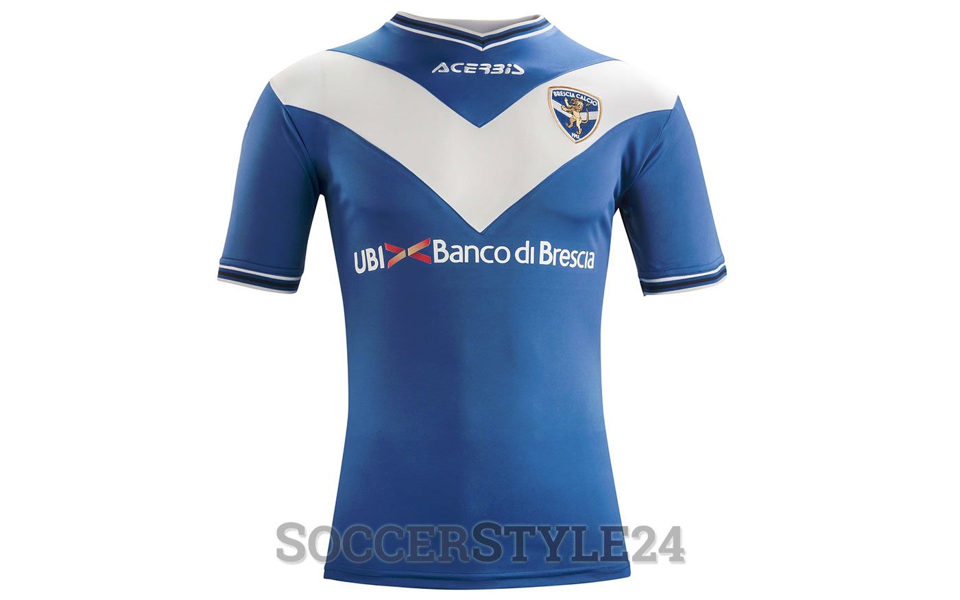
I like that. Tough to get away with in football because of the rugby league usage.I was thinking that it's funny that De Zerbi's home team's (Brescia) shirt design would fit you perfectly, given your logo. The white "V" changes width and depth depending on the years (in the past it went to the belly and was thinner) but it's basically a big white V over a blue shirt.
This was one of the best versions in my opinion:
Edit: They're also called "The Swallows" because of that shape on the shirt (although their province has enough lakes to get some seagulls and swallows aren't total white)
Oh I didn't think about that, I don't watch rugby so I had no idea it was a common rugby pattern - the only one I'm familiar with here in Italy are the horizontal stripes, the kind that Celtic also wearI like that. Tough to get away with in football because of the rugby league usage.
I'd take that for a season!I was thinking that it's funny that De Zerbi's home team's (Brescia) shirt design would fit you perfectly, given your logo. The white "V" changes width and depth depending on the years (in the past it went to the belly and was thinner) but it's basically a big white V over a blue shirt.
This was one of the best versions in my opinion:
Edit: They're also called "The Swallows" because of that shape on the shirt (although their province has enough lakes to get some seagulls and swallows aren't total white)
I would as well and I’m very firmly in the ‘stripes’ camp. I hated with a passion the blue kit from a couple of years ago.I'd take that for a season!
There's a fella around this way that keeps old running tops going by stitching old ones together – in the name of sustainability – and this reminds me of one of them!
Ooo interesting call. Butter/similar on the bread first, then the marmite?Marmite on the toast