Got something to say or just want fewer pesky ads? Join us... 😊

Ditch the stripes?


hans kraay fan club

The voice of reason.
Helpful Moderator
Mar 16, 2005
61,765
Chandlers Ford
By using the Rayleigh criterion the resolution of a human would be about 1 cm would it not at 100 m? So you should be more than capable of reading the numbers providing a decent colour contrast. The names may be an issue.

Well, that's the issue here isn't it? (or at least it was last season)


Superphil

Dismember
Jul 7, 2003
25,477
In a pile of football shirts
It's unacceptable that a multi-billion dollar clothes manufacturer is either incapable or unwilling to design us a shirt that can incorporate the Amex logo, but Errea could.

We've had plenty of time to get used to it, ever since Nike was announced it was nailed on that we would have a kit based on their standard templates, and their current templates do not have a sponsor bar. Shame it seems such a hash up, but it was expected.


dejavuatbtn

Well-known member
Aug 4, 2010
7,353
Henfield
Interesting debate. A couple of seasons after I started watching the Albion we changed to an Arsenal type shirt in blue and white, we then had a plain white shirt in the seventies, and went for an all blue kit when pronoted to Div One so the sponsor's name would stand out. This then changed to having the pinstripes, which, to be honest, look pretty good. My prefererence is the stripes but in a funny sort of way, not having them for a few seasons makes it all so much better when they change back again! Strange logic, I know, but either way it makes for interesting debate.
Having said all that, I agree with those commenting and had predicted that Nike cannot match Errea for custom kits. It would be interesting to know just how better the deal is with Nike, 'cos at least Errea came up with some decent designs.


DNB_Seagull

Dirty Northerner. For now
Apr 27, 2014
579
Pinstripes look and have always looked cheap and nasty - the 80's versions were particularly duff.

Striped shorts is the answer.

Millwall kit last season looked great. WBA? Villa? Inter Milans kit. Seen it! Just ditch Nike. Tbh not after a great kit just not a shit one.


oneillco

Well-known member
Feb 13, 2013
1,259
Yeah I'm on your side mate; how come all these "delicate" "tards" who are "bitching" see that you NOT trying to cause offence?

Keep your PANTS on. I'm just suprised that when watching the team you support people are unable to tell who a player is by size, haircut, mannerism, colour of boot, ability to stand up without falling over (see KLL), geographical location upon the football pitch or any other trait and have to rely on the number. I apologise for the tards comment it was a light hearted dig and not meant to cause offense but I should know how delicate some people on here are. I can't help thinking that people bitching about being able to see the numbers last season is at least partly to blame for the new home and away kits looking like two different shirts stuck together. All stripes or all plain looks so much better.


withdeanwombat

Well-known member
Feb 17, 2005
8,714
Somersetshire
I suppose it was time this ball hooks was raised again.

Okay, let's go red and white quarters with green shorts and pink and orange hooped socks and change our nickname to "The Clowns".


Not Andy Naylor

Well-known member
Dec 12, 2007
8,848
Seven Dials
Time to go back to the glory days of the blue shirt with white sleeves.

Speaking of glory days -

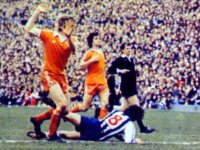
blackpooltackle.jpg

Some bloke called Peter Ward, in stripes (not pinstripes) and you can read the number quite clearly. It's not rocket science.


Albion and Premier League latest from Sky Sports


Top
Link Here