Got something to say or just want fewer pesky ads? Join us... 😊

New shirt has arrived


leigull

New member
Sep 26, 2010
3,810
That's still a printed logo on a striped shirt, with no break in the stripes.

The difference there will be Qatar Airways permitting their logo to be used without a border of space around it.

Ah, understand now.


Bozza

You can change this
Helpful Moderator
Jul 4, 2003
55,825
Back in Sussex
Mr Barber's email and my responses to it. Only posted on here though, not actually sent to him - I've no idea what his email address is.

PB's responses in green below.

- Nike uses plastic iron on-style logos on all its shirts - including Barcelona, Juventus and Man U; the sublimation printing option (as per Errea's last kit) isn't available to any club from Nike. Maybe so but they don't look half as bad as this one. If I have been paying attention, the iron-on logos on the actual playing shirts now end where the blue stripes end, i.e. the iron-on logo is not ironed-on over the white stripes and so the mis-match in shades is less noticeable. Why has this not been done with those being sold to us?

The size of the sponsor logo box is predetermined by the League – it will look ever so slightly different on replica shirts depending on their size. As such, it won’t always perfectly match the stripes on the shirt.

- our sponsor logo is "white blocked" to meet Amex corporate ID guidelines - it's not "Sunday league" - it's conforming to the corporate ID rules of one of the world's most protected brands! Maybe so, but I've seen more professional-looking shirts from Sunday league teams

Kit design is ALWAYS subjective. As ever, sales will determine whether it’s a successful shirt or not. To date, orders are up 400% on any previous Albion shirt. Not many Sunday League teams sell that many shirts…our stripes will always limit the way a sponsor logo, as carefully protected as Amex’s, is applied OR it will limit the design of the shirt. There will always be a compromise somewhere. In the Errea kit, it was the break in the stripes (which many fans hated when it was launched), in the Nike design, it’s the block design. Sunday League teams tend not to have to worry about world class organisations (with very strict brand guidelines) sponsoring them…

- if we could done it a different way we would have - striped shirts are always a challenge for application of sponsor logos (or numbers) and this is further complicated by a sponsor logo that's blue! I wasn't present for these discussions but if they're true, a conversation along the lines of "Let's make the iron-on patch the same shade of white, and exactly the right width to not overlap the vertical stripes" might have made a world of difference to customer satisfaction

The white box colour is determined by Amex – not the club or Nike. It’s no different to Amex’s blue being different to the club’s blue. It’s a corporate identity not a perfect match for the shirt. Also, the same colour will always replicate slightly differently depending on the material it’s printed on. A perfect match will always be hard to achieve even if the white was the same pantone from the start.

the size of the white block is determined by Football League regulations and, like most sponsors, Amex require maximum permitted size for their logo; there has to be a minimum amount of white space around the Amex lettering Message received and understood... so why are the players shirts in possession of a smaller iron-on box, as suggested by most of the photos and streams from pre-season games so far?

See above.

last year's shirt also had a "white block" around the Amex logo - it meant that the stripes were broken in a different way as it was printed in to the shirt design (many fans hated this!) Why yes, yes it was, but it was designed so that the white block was integral to the shirt and even accepting the limitations of what Nike produce, the iron-on logo this year is poorly presented.

Again, as previously explained, Nike do not offer sub-liminated sponsor logo printing. I have a Juventus shirt hanging in my office. It has a heat-pressed Jeep logo on it. The application is identical. There are no break in the Juventus black and white stripes for exactly the same reason.

- we can't have a blue or white Nike logo because one half of wouldn't show up against our stripes! So it had to be black (or another contrasting colour) But a colour that was absolutely identical to one of those stripes would have been a vast improvement

I’m not sure I understand this point - as explained above, the Nike tick is deliberately a different/contrasting colour from the stripes. That’s Nike’s specification. They don’t use the same colour tick over stripes of the same colour.

- we went for plain back to address the lettering / numbering issue of last year - and also to give the shirt a unique look: no other club in the world has this shirt! Why does this response make me smile?! I'm sure no other club in the world would attempt to replicate it either…

Clubs aim to sell as many shirt as possible. It’s a key part of a club’s business. Most professional football clubs I know would replicate this shirt if it resulted in a 400% increase in sales for them…a sales uplift of this kind would certainly make them smile!

- red numbers were not available to us and in any case would not have shown up on a blue-backed shirt! I accept this.
Thank you!


Bozza

You can change this
Helpful Moderator
Jul 4, 2003
55,825
Back in Sussex
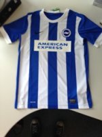
As I've said before, it's not the fact it's iron on, that is fine with me. It's the fact the 2 whites are completely different shades that makes it look so bad.

I'm not sure phone snapped images indoors are doing the iron-on logo any favours, particularly when the transfer is reflecting the light.

By all accounts the new look store and Nike merchandise are pretty impressive. I'll reserve judgement until I've seen it for myself.


shaolinpunk

[Insert witty title here]
Nov 28, 2005
7,187
Brighton
I'm not sure phone snapped images indoors are doing the iron-on logo any favours, particularly when the transfer is reflecting the light.

By all accounts the new look store and Nike merchandise are pretty impressive. I'll reserve judgement until I've seen it for myself.

It certainly looked much better in person while watching the Lewes game than any photo I've seen


Man of Harveys

Well-known member
Jul 9, 2003
18,739
Brighton, UK
The poor quality is more baffling when you consider this classic kit is only £20 at the moment

View attachment 56506

Now THAT's a shirt. Why wouldn't anyone buy of them instead? So much more stylish, classier. And without all that puerile build-up bullsh1t.


hans kraay fan club

The voice of reason.
Helpful Moderator
Mar 16, 2005
61,437
Chandlers Ford
THis quote from PB is hugely important, and hasn't really been considered:

The white box colour is determined by Amex – not the club or Nike. It’s no different to Amex’s blue being different to the club’s blue. It’s a corporate identity not a perfect match for the shirt

So basically you have people considering the 'American Express' wording alone to be 'the logo', and discussing how best that should be applied - to an exactly matched background / to a gap in the stripes, etc, yet PB is stating there that 'the logo' comprises the wording AND the rectangle (including obviously, the colours used).

Thus, by that rational, even if 'the logo' HAD been sublimated into the fabric (which Nike won't do, anyway) people would STILL be moaning that the whites of the box didn't match that of the stripes.


Charles 'Charley' Charles

Well-known member
NSC Patron
Oct 8, 2005
3,521
The Mile Of Oaks
I'm not sure phone snapped images indoors are doing the iron-on logo any favours, particularly when the transfer is reflecting the light.

By all accounts the new look store and Nike merchandise are pretty impressive. I'll reserve judgement until I've seen it for myself.
Completely agree, I even said exactly the same on the original thread a couple of weeks ago. In the flesh they may appear completely different. However, having seen several different pictures, some professional, some mobile taken they do appear to be different shade in all pictures. Just so I don't come across as totally negative, I believe there were some pictures about of coaching staff in black tops, these I thought were really nice, and hold high hopes for the rest of the leisure range. It's just that one aspect of the home shirt I don't like, at the moment, such isa shame as really like the rest of it.


Mackenzie

Old Brightonian
Nov 7, 2003
33,571
East Wales
PB's responses in green below.

Feisty corporate blah blah
Fair play to PB for trying to defend the shirt. It is a bit of a dogs dinner.

I'll look forward to buying it in the sale in 18 months time.

#cheapskate


seagully

Cock-knobs!
Jun 30, 2006
2,955
Battle
THis quote from PB is hugely important, and hasn't really been considered:


So basically you have people considering the 'American Express' wording alone to be 'the logo', and discussing how best that should be applied - to an exactly matched background / to a gap in the stripes, etc, yet PB is stating there that 'the logo' comprises the wording AND the rectangle (including obviously, the colours used).

Thus, by that rational, even if 'the logo' HAD been sublimated into the fabric (which Nike won't do, anyway) people would STILL be moaning that the whites of the box didn't match that of the stripes.

That's all well and good but begs the question why there is no box on the goalkeeper shirt?


ozzygull

Well-known member
Oct 6, 2003
3,857
Reading
This is the one I bought for the nipper. Large Boys size. The photo does make the sponsor logo look worse then it is, but it's not great. Not sure it will bother the nipper though.
 

Attachments

  • IMG_0235.JPG
    IMG_0235.JPG
    22.1 KB · Views: 436


DNB_Seagull

Dirty Northerner. For now
Apr 27, 2014
579
Bought mine for £35 as a kids shirt. Feel so shite. The sponsor block of death is half way through the blue stripes. Awful. Amex can **** off if they decided this.


hans kraay fan club

The voice of reason.
Helpful Moderator
Mar 16, 2005
61,437
Chandlers Ford
That's all well and good but begs the question why there is no box on the goalkeeper shirt?

Because Amex's corporate colours are BLUE and WHITE, and the only colours the lettering can appear in, so the 'no background' option on a blue and white shirt wasn't an option.

Amex want this shirt to look good / sell / be seen in the biggest possible quantities, as much as anyone else does. they are protecting their trademarks / corporate identity, not trying to be purposefully difficult.
 
Last edited:


gazingdown

Well-known member
Feb 26, 2011
1,055
THis quote from PB is hugely important, and hasn't really been considered:


So basically you have people considering the 'American Express' wording alone to be 'the logo', and discussing how best that should be applied - to an exactly matched background / to a gap in the stripes, etc, yet PB is stating there that 'the logo' comprises the wording AND the rectangle (including obviously, the colours used).

Thus, by that rational, even if 'the logo' HAD been sublimated into the fabric (which Nike won't do, anyway) people would STILL be moaning that the whites of the box didn't match that of the stripes.

So, was last year's (Errea) white colour part of the shirt the same as the Amex white OR was the Amex white box the same colour as the shirt white?

Could the club not have requested from Nike that the white be the same as the Amex white (or as close to as possible)?

Also, I read on these thread about Nike only doing iron on, not doing it the same way as Errea etc. So, that begs the question, why use Nike in the first place, why not an alternative manufacturer that can produce better looking shirts?

Anyway, the reasons/excuses are all irrelevant, it's the end result that matters. The end result is poor. For that reason alone, I won't be buying one.


Poppett63

Well-known member
Jul 16, 2011
392
Just been out in Eastbourne wearing it, lots of positive comments. As I said, I don't like the sponsor logo thick transfer but overall the shirt looks really good!


Albion and Premier League latest from Sky Sports


Top
Link Here