Got something to say or just want fewer pesky ads? Join us... 😊

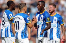
[Albion] I think the kit looks great


GT49er

Well-known member
Feb 1, 2009
46,814
Gloucester
I agree, looked good - the 5 goals helped though!

It's slightly less shit than some that we've had, I suppose. A truncated stripe is better than no stripe at all.......... but why a blue and white stripe kit needs any yellow in it is beyond me. Have they somehow managed to over-buy so much yellow dye that they have to use it up regardless? Couldn't they just make the team towels and underpants yellow in that case, and leave the shirts alone?
 
Last edited:


raymondo

Well-known member
Apr 26, 2017
5,717
Wiltshire
It's slightly less shit than some that we've had, I suppose. A truncated stripe is better than no stripe at all.......... but why a blue and white stripe kit needs sny yellow in it is beyond me. Have they somehow managed to over-buy so much yellow dye that they have to use it up regardless? Couldn't they just make the team towels and underpants yellow in that case, and leave the shirts alone?

Yes, it's a bit canary, but it irritated me less than I expected!


Eeyore

Colonel Hee-Haw of Queen's Park
NSC Patron
Apr 5, 2014
23,658
I think it looks good on them. Maybe not on pot bellied supporters.


CaptainDaveUK

Well-known member
Oct 18, 2010
1,506
3FB4566F-011C-4FB1-B234-EA439266985B.jpeg

I did wonder if it might look better during a game as you see lots of different angles. So from the side for example it looks more striped than from the front. All the promo pics were from the front which didn’t do it any favours. Watching from the stands people may like it more than they did from seeing it online.


dangull

Well-known member
Feb 24, 2013
5,116
To be fair, the Fat Boy Slim as a role model with it hugging to his belly was probably not a great advert for it.
It looked ok with professional players wearing it. It will not be my favourite however.


dangull

Well-known member
Feb 24, 2013
5,116
To be fair, the Fat Boy Slim as a role model with it hugging to his belly was probably not a great advert for it.
It looked ok with professional players wearing it. It will not be my favourite however.


BadFish

Huge Member
Oct 19, 2003
17,143
Its not that bad, prefer the proper stripes or even the pin stripes of a couple of seasons ago.

I think it is going to grow on me . . . won't be rushing out to get one though.


Scotchegg

Well-known member
Sep 1, 2014
313
Brighton
Much preferred it at the game rather than in any promotional pictures I'd seen until now. Not the horror show I thought it was when it was actually on the pitch.


American Seagle

Well-known member
Jun 14, 2022
705
Still looks like the back from a white uniform, the front and sides from a blue and white uniform and the shoulders from a blue uniform all sewn together. Comes across like Nike had three used kits they had to do something with and Frankensteined them together.


Green Cross Code Man

Wunt be druv
Mar 30, 2006
19,736
Eastbourne
I hate the kit. But once the team were out and playing beautiful football, I didn't notice once, not even once.


kevo

Well-known member
Mar 8, 2008
9,119
The yellow is still yuk. Otherwise I like it.


spence

British and Proud
Oct 15, 2014
9,816
Crawley
It's shit


Albion and Premier League latest from Sky Sports


Top
Link Here