Got something to say or just want fewer pesky ads? Join us... 😊

Kit announcement date and time being announced at 4:30


Barry Izbak

U.T.A.
Dec 7, 2005
7,326
Lancing By Sea
I was planning to buy a new home shirt this season - haven't had one since Amex Season One

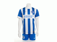
But as others have said, the sticker on the front rules it out I'm afraid. Looks cheap. And at forty five quid it ain't.


Ninja Elephant

Doctor Elephant
Feb 16, 2009
18,855
Like others, I won't be buying the home shirt again because of the iron on panel. It looks rubbish, cheap and tacky. Not things I'd choose to associate either with the Albion, or with the company advertised in the panel.

The away shirt is very dapper so that will be bought after the first game when Jiri Skalak's number can't be changed.


dazzer6666

Well-known member
NSC Patron
Mar 27, 2013
52,586
Burgess Hill
Like others, I won't be buying the home shirt again because of the iron on panel. It looks rubbish, cheap and tacky. Not things I'd choose to associate either with the Albion, or with the company advertised in the panel.

The away shirt is very dapper so that will be bought after the first game when Jiri Skalak's number can't be changed.

Spot on, I really like the away shirt. Much better.


Not Andy Naylor

Well-known member
Dec 12, 2007
8,798
Seven Dials
It's Brighton from in front, Bury FC from behind. If, as they claim, it's based on the Peter Ward kit, then surely they could have a white patch for the numbers.


Raphael Meade

Well-known member
Jul 5, 2003
4,125
Shoreham/LA
Genuinely shocked that a club at this level isn't able to figure out anything better than a stick on sponsor panel that looks that bad. Can't quite believe.


Doc Lynam

I hate the Daily Mail
Jun 19, 2011
7,207
Why not something like that with Amex Express name?
Black wording white border.

albion5.jpg


Quinney

Well-known member
Aug 3, 2009
3,654
Hastings
You would have thought it was in American Express interests to make it look as good as possible. The stick on logo detracts from the shirt and does not reflect well on them.


Jimmy Grimble

Well-known member
Can anyone tell me why the blue on the (cheap looking) badge is different to the blue on the shirts?

And why the tick on the shorts isn't red to keep it consistent?

I never buy club shirts so I'm not overly bothered, I just like to have a kit that looks decent and represents us well on TV, etc.


SweatyMexican

Well-known member
Mar 31, 2013
4,101
A red Nike tick? ???

Ironed on sponser, again? :facepalm:

Apart from that, it's okay I guess.


Cold Gettin Dumb

Active member
Jan 31, 2013
462
I think the front is nice, bar the red nike tick...
The back just doesn't look right. AT least its not as bad as the back of the other season's red and black striped kit. That one looked like you were wearing a short waistcoat when viewed from the back...


BensGrandad

New member
Jul 13, 2003
72,015
Haywards Heath
It has to be remembered that these shirts are probably made in a Far East sweat shop at about £2.50 a throw so there is a limit to what you can do with the material at that price. I am past buying team shirts but I would have preferred the blue and white striped back with a large white patch and the numbers in red.


Easy 10

Brain dead MUG SHEEP
Jul 5, 2003
61,783
Location Location
Front is ok I suppose, I don't really notice the tacky iron-on nature of the sponsor from the stands. The back is proper shit though. It's like we're wearing 2 different kits, it just doesn't match up or look right. That will irritate me all season long.

Oh well. Only for a year I suppose. I never buy them anyway.


Albion and Premier League latest from Sky Sports


Top
Link Here