brightn'ove
cringe
FFS that is horrible. We will look like Leeds from the back again. Just put the ****ing stripes on the as well, why is it so hard?
I get your point but it looks nothing at all like Leeds from the back.
FFS that is horrible. We will look like Leeds from the back again. Just put the ****ing stripes on the as well, why is it so hard?
1. Ah, just kids being kids.
2. Ah, just old people being old.
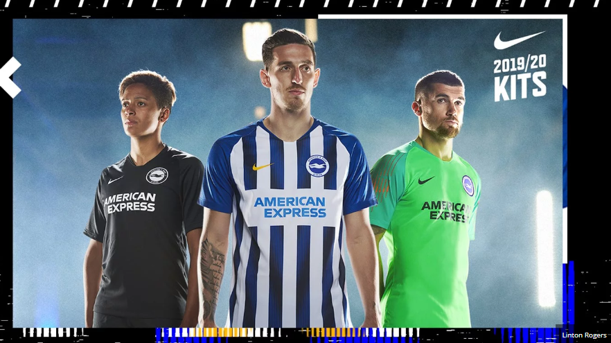
Eek! Is that a TRANSFER across the home shirt?!?
Single-colour badge on away shirt. Hmmmm.
GK shirt looks MINT.
What's wrong with white shirts with a couple of bits of blue so that we keep the club colours? We have no association whatsoever with black, green or yellow.
Big fan of the shirt designs, the American Express logo always annoys me in the home kit though, it doesn’t look like it fits in with the white box around it. You would think a multi billion pound company could make a better logo.

Or maybe a multi billion dollar kit company could make a better kit
Fair point, but I like the kit, I assume the font and the white box around it would be chosen by American Express, not sure though.Or maybe a multi billion dollar kit company could make a better kit
Would look great without the white block on the front. That is very much American Express' fault.
Amex don’t make the kit, but they do have rules about their branding as do most other corporate organisations. CIs can be very rigid, I deal with them for a living, there simply isn’t an option to meddle with a brand once an organisation has chosen how it is to look. With a logo formed of a wordmark you will always have a clear space around it, it is part of the logo, not just a white box. Nike fail, not Amex, or perhaps BHA fail for choosing the lucre that nike pay rather than choosing a kit manufacturer who can provide for teams outside the global sides. Then again, they modified their striped template last year to include a white band for the logo, are we sure this one is a transfer?
View attachment 110343
Hmmm... a white back again, for the that "three kits stitched together" look.
What's wrong with white shirts with a couple of bits of blue so that we keep the club colours? We have no association whatsoever with black, green or yellow.
What's wrong with white shirts with a couple of bits of blue so that we keep the club colours? We have no association whatsoever with black, green or yellow.
You say that, but if that same kit were released today, all of the following 'flaws' would have been raised on this thread:
1. Why can't we have stripes on the back?
2. Why isn't the badge centred on a stripe?
3. Why isn't the Nike logo centred on a stripe?
4. Why is the Nick logo black?
5. Why no stripes on the sleeves?
6. Why can't we have a collar?
7. Iron-on sponsor, FFS!
