Got something to say or just want fewer pesky ads? Join us... 😊

[Albion] BHAFC new kit 2019/20


studio150

Well-known member
Jul 30, 2011
29,637
On the Border
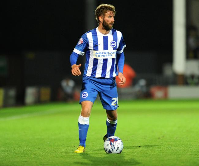
Obviously I don't understand the marketing blurb that goes with the new home shirt. Having seen distorted take on Albion's traditional blue and white stripes, I was expecting to see zig-zag stripes, rather than the standard vertical straight stripes.

Silly me, I will now have to learn marketing speak as a second language


Wilko

LUZZING chairs about
Sep 19, 2003
9,924
BN1
Although I think the kits are ok, they are hardly exciting are they? Very jealous of the likes of the Arsenal Adidias kits for example for this season. The sooner we get out of this Nike borefest the better IMHO.


Wozza

Shite Supporter
Jul 6, 2003
23,634
Online
FFS that is horrible. We will look like Leeds from the back again. Just put the ****ing stripes on the as well, why is it so hard?

Somewhere in between would do...

3.png


Quinney

Well-known member
Aug 3, 2009
3,653
Hastings
Certainly won’t be buying the home shirt, looks good from the front but as per the last couple of shirts the back is a complete mess. Surely it’s not a shite sticker on the front. How hard is it to design a decent shirt.
I will however part with good wedge for the away shirt which looks decent.


Sent from my iPad using Tapatalk Pro


Biscuit

Native Creative
Jul 8, 2003
22,220
Brighton
My eyes are giving up on me.. is that a panel on the home shirt? If so I won't be buying it.

Not sure about the black kit either.. looks like relegation wear to me.


TWOCHOICEStom

Well-known member
Sep 22, 2007
10,582
Brighton
Interesting to see what colour numbers they’ll go with. I don’t like yellow as our tertiary colour and it feels weird to switch back and forth between yellow and red. Away kit is alright.


spence

British and Proud
Oct 15, 2014
9,814
Crawley
Liking the away kit. Home kit will always look shit until they bring back stripes on the back which they won't.


hans kraay fan club

The voice of reason.
Helpful Moderator
Mar 16, 2005
61,366
Chandlers Ford
100%. How is it that us mere mortals can see this and yet those paid to come up with the designs churn out absolute crap most years?

You say that, but if that same kit were released today, all of the following 'flaws' would have been raised on this thread:

1. Why can't we have stripes on the back?
2. Why isn't the badge centred on a stripe?
3. Why isn't the Nike logo centred on a stripe?
4. Why is the Nick logo black?
5. Why no stripes on the sleeves?
6. Why can't we have a collar?
7. Iron-on sponsor, FFS!


Eeyore

Colonel Hee-Haw of Queen's Park
NSC Patron
Apr 5, 2014
23,599
The only shirt I bought was the black collared one of 2015-17. I somehow lost it. I really liked those yellow and black ones. I'd buy one again but it seems folk want to keep hold of them :tantrum:


Albion and Premier League latest from Sky Sports


Top
Link Here