- Jul 7, 2003
- 47,221
Rancid, goes without saying.

Rancid, goes without saying.
I just hope ours is PROPER stripes, i.e. no fade, goes all the way up and down, and is on the back and sleeves. Having various striped 'elements' of the shirt makes it look PATCHWORK.
I suppose ours will be release late July?

Usually worn by the team in the first early July friendly.I suppose ours will be release late July?
Winner by a country mile.
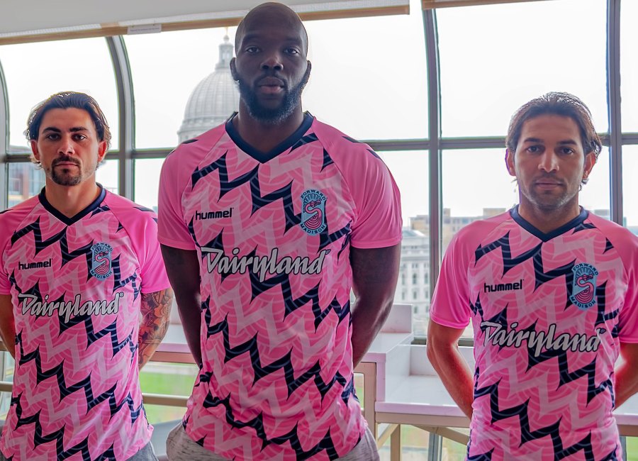
(Forward Madison FC. I have no idea)

Rancid, goes without saying.
Winner by a country mile.
(Forward Madison FC. I have no idea)

Winner by a country mile.
(Forward Madison FC. I have no idea)

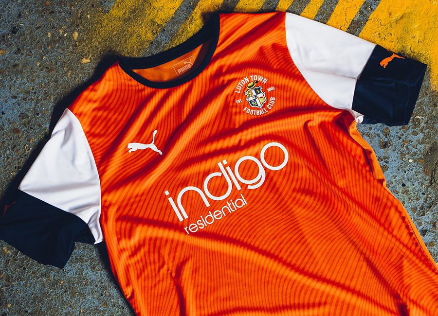
Luton, stinking out the Championship in this effort next season.
Haha.
I've a couple of good mates who work at Saints, one of whom told me early this week that he'd seen the kit and it was horrific! Apparently the Chinese company sponsoring the shirts provided no logo, and the club basically had to produce something themselves. He'd warned me the logo was blue and looked shit on the red shirts.
Nasty
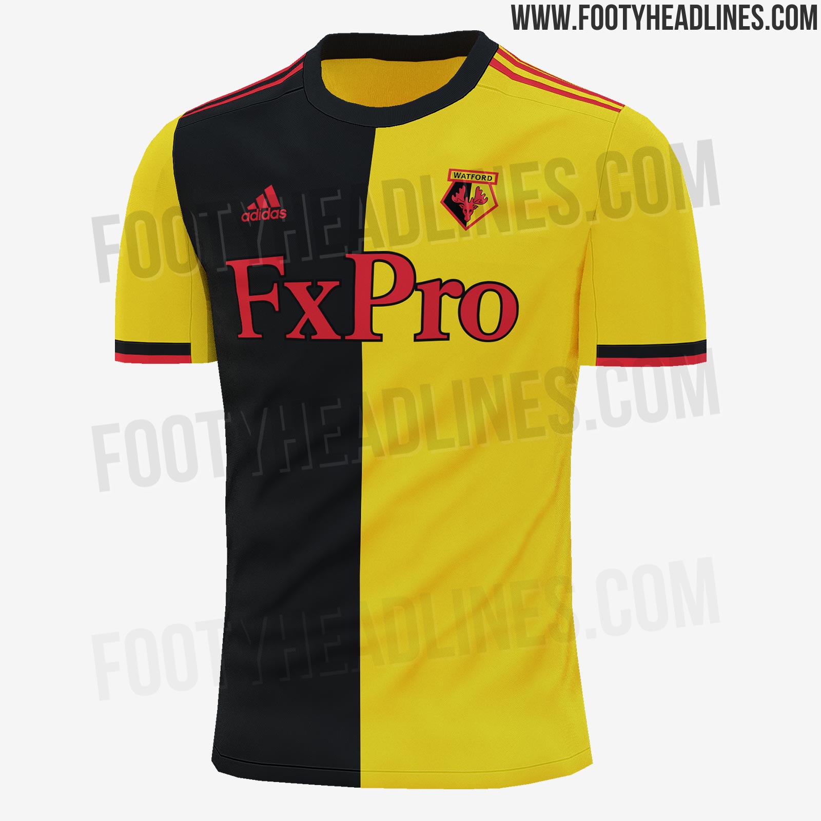
So they CAN do stripes on sleeves...just not for us. Nike really are shithouse.
Usually worn by the team in the first early July friendly.