TWOCHOICEStom
Well-known member
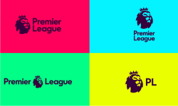
Now, I know everyone hates a rebrand. Especially when it's a product/brand that they're very familiar with (see the EFL for example).... but what the actual shit were they thinking when they came up with this.
http://www.theguardian.com/football...sual-identity-2016-17-season?CMP=share_btn_tw
http://www.theguardian.com/football...sual-identity-2016-17-season?CMP=share_btn_tw