Barrel of Fun
Abort, retry, fail
Well?
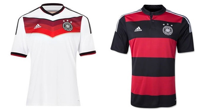


Something quite nice about the kraut's away shirt.