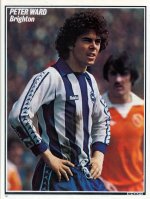
Got something to say or just want fewer pesky ads? Join us... 😊

[Albion] Albion bottom of the Premier League...


lawros left foot

Glory hunting since 1969
Jun 11, 2011
13,726
Worthing
I like both better than last seasons. The away kit last year, was the Albion kit I’ve most disliked ever. It’s the weird khaki/snot coloured sleeves.


Me and my Monkey

Well-known member
Nov 3, 2015
3,353
I’ve seen loads of people out and about in the green away kit. Loads. Or maybe it just stands out more due to its greenness.


Dick Head

⭐⭐⭐⭐⭐
Jan 3, 2010
13,632
Quaxxann
Written by a child I guess. There are few shirts on there I really like and certainly only 1 I would wear in public and there really is something about the palace shirt that makes me sick. perhaps is just a pavlovian response.

Yeah, but colour palette.


Bry Nylon

Test your smoke alarm
Helpful Moderator
Jul 21, 2003
19,852
Playing snooker
The whole kit thing pisses me off without fail every year. And it pisses me off that it pisses me off, because it really shouldn't. How can something that should be so simple end up as such a cluster**** season after season?

What we need for our home kit is THIS (admittedly with a more modern collar). And the back should look like THIS (with the panel starting slightly higher to incorporate the player's name). And that is IT. No stupid design features or gimmicks. Just THIS. Piss easy.
 

Attachments

  • peterward5.jpg
    peterward5.jpg
    470.4 KB · Views: 249
  • blackpooltackle.jpg
    blackpooltackle.jpg
    242.5 KB · Views: 250


Hungry Joe

SINNEN
Oct 22, 2004
7,636
Heading for shore
Is that the green one? I never buy replica shirts but I'm tempted to get that. I say 'tempted' but I'm guessing the price will put me off.

Yes, the green one mate. I could understand the 'goalkeeper' jibe if most goalies actually still played in green shirts, but when was that last actually the case? Decades ago I'd wager.


perseus

Broad Blue & White stripe
Jul 5, 2003
23,457
Sūþseaxna
I don't see a lot wrong with the home kit tbh. Its blue and white stripes, thye're never going to re-invent the wheel, unless you're going to go doing something REALLY different and outlandish like that Argentina kit we had at Withdean (which was bloody awful IMO). The sponsors aren't iron-on, and having seen it up close and handled the goods it seems well enough made. So its a template and not "bespoke" - so what ? Can't say I'll lose any sleep over it. As long as we're in the stripes, and its the proper blue and white with no messing around with faded bits and shit, I've got no beef.

I guess I'm not the target audience though. Must be getting old.

I reckon it's white and blue, not blue and white, broader stripes (which I have always said). Controversial, but ordinary. Number 2 bus is still mostly blue.

Albion Bus_9728sm.jpg

I thought we might go for a very blue home kit and white mostly for away ???


Grizz

Well-known member
Jul 5, 2003
1,251
The whole kit thing pisses me off without fail every year. And it pisses me off that it pisses me off, because it really shouldn't. How can something that should be so simple end up as such a cluster**** season after season?

What we need for our home kit is THIS (admittedly with a more modern collar). And the back should look like THIS (with the panel starting slightly higher to incorporate the player's name). And that is IT. No stupid design features or gimmicks. Just THIS. Piss easy.

Absolutely agree. That Bukta kit was lovely, drop the weird sleeves, but the main body should be those blue and white stripes on both sides. I've not bought a kit since the opening of the Amex, but would buy this straight away.


Driver8

On the road...
NSC Patron
Jul 31, 2005
15,982
North Wales
The whole kit thing pisses me off without fail every year. And it pisses me off that it pisses me off, because it really shouldn't. How can something that should be so simple end up as such a cluster**** season after season?

What we need for our home kit is THIS (admittedly with a more modern collar). And the back should look like THIS (with the panel starting slightly higher to incorporate the player's name). And that is IT. No stupid design features or gimmicks. Just THIS. Piss easy.

Presumably not the same sandpaper type material as the original though!


Harry Wilson's tackle

Harry Wilson's Tackle
NSC Patron
Oct 8, 2003
50,124
Faversham
...of kits. Apparently. Barbs will be FUMING:

"They’ve just gone with the generic template for Nike really and just added the crest and sponsor. I also think their away kit looks like a goalkeeper kit.
I don’t think you’d see anyone wearing that out. Well, I’d hope not anyway.
Style: 3/10. Originality: 2.5/10. Wearability: 2.5/10 - Total: 8 out of 30"


More >>> https://www.bbc.co.uk/bbcthree/article/b66bc111-d70f-4049-8bcd-c6c4b6dd3f75

Keeping with the spirit of a couple of other recent threads and the posts in them.... our away kit is RUBBISH. It has a GIRL in it. Whatever next? :eek::shrug:


:wozza:


Superphil

Dismember
Jul 7, 2003
25,419
In a pile of football shirts
Presumably not the same sandpaper type material as the original though!

I have a couple of those, and yes, very harsh. Recently however I acquired a 1977 Matchworn shirt from an ex players family, it’s the same style but the fabric is quite different, soft and stretchy in fact.

14965062-9FB4-4BFD-BCD2-2182C443E13D.jpeg 2ED427D6-D985-42C5-9995-F7D2F1572260.jpeg


Acker79

Well-known member
NSC Patron
Nov 15, 2008
31,864
Brighton
I often feel in the minority when it comes to our kits. I tend to like the less popular ones, and dislike the popular ones. It's all subjective really, isn't it, but the fact they listed Palace so high and Brighton bottom has me suspicious about the impartiality of the author.


edna krabappel

Well-known member
NSC Patron
Jul 7, 2003
47,221
I often feel in the minority when it comes to our kits. I tend to like the less popular ones, and dislike the popular ones. It's all subjective really, isn't it, but the fact they listed Palace so high and Brighton bottom has me suspicious about the impartiality of the author.

Quite. Particularly when you look at the abysmal effort Palace are wearing at home this season.

I was a bit meh when I first saw their kit reveal. Fast forward to seeing their new home shirt being worn in matches and its true ugliness really shines through. You can bang on about templates all you like, but when you get some semi-bespoke piece of crap like their red and blue effort with the horrendously ugly fade effect on the bottom half, frankly we have lucked out by comparison.


footychick

Nicola
Dec 8, 2005
4,406
Soham, United Kingdom
Spot on.
Straight off the Nike template shelf. No thought or originality went into the design this season.
The only nice bit about the shirt -The inscription of Sussex by the Sea...shame its inscribed on the inside of the shirt!
I agree. Leeds have Marching on Together on theirs but on the outside [emoji848]

Sent from my G8341 using Tapatalk


Albion and Premier League latest from Sky Sports


Top
Link Here